I’m an engineer by training. I’ve had a varied career, starting with building telecommunications networks, then transitioning to publishing which most recently brought me to Typefi in 2006.
Even before I joined Typefi, visual design was always important in my work, be it in scholarly, trade, or technical publishing.
Typefi has been around for over 20 years now. We have more than 10,000 users worldwide, and their specialties lie in everything from education and travel to financial services and government organisations.
What this means is that we have seen every type of design, and every type of source content to populate a design. Everything from Microsoft Word to DITA and custom, proprietary XML schemas have been part of the Typefi workflow.
One common challenge we’ve faced for all these customers is how to productise their data in a visually compelling way while doing it cost-effectively and efficiently, and keeping the content in a reusable structure.
Does design truly matter?
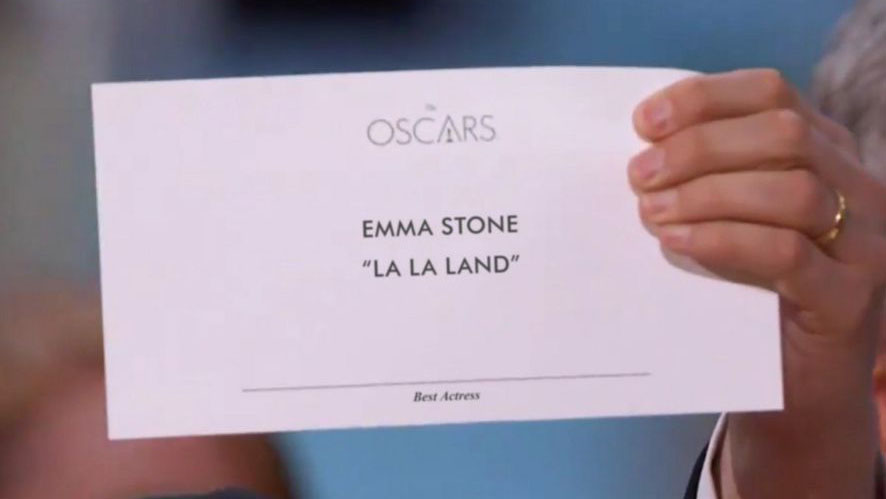
You may remember the presentation of the award for Best Picture at the 2017 Oscars. The unfortunate presenters were handed the card for a different category, resulting in them accidentally announcing the wrong winner.
But how did the mistake happen if the card was for a different category? The answer is simple: bad visual design. The award category was placed in tiny cursive font at the bottom of the page and was easily missed in the confusion.
But why does type design matter for DITA content? The Oscar cards are probably not authored or maintained in DITA, but many other documents are—for example, IAEA nuclear safety standards.
Now, if the wrong information is conveyed in the nuclear safety standards, I think the consequences could be significantly higher than an Oscar faux pas.
The purpose of any publication is to convey information, and a good design conveys critical information quickly and clearly.
Funny or fraudulent
I often hear that the need for great visual design does not apply to product documentation.
Some say the product is most important and the visual documentation doesn’t matter. For me, this is the equivalent of saying if a meal meets nutritional standards, the taste and presentation of the meal do not matter.
Now, I would disagree. Sometimes, when a product fails to live up to its documentation, it’s funny, like making a microwave meal that doesn’t quite match the appealing packaging. But when the packaging and documentation look like a Bugatti and you get a dodgem car, it’s fraudulent.
A product is like a good meal. It should be nutritional, well presented, and taste good. The experience promised by the look and the smell should match the taste and nutritional value.
Similarly, the quality of the product should set the bar for the quality of the packaging, documentation, and overall product experience. Even B2B products should effectively differentiate by having a consistent and reliable consumer experience.
Any desk in a pandemic
A product never exists in a vacuum. The advertising, collateral, and supporting materials all factor into the overall experience.
A good product presented with poor documentation or packaging creates a kind of cognitive dissonance, resulting in a lower overall customer experience of the product.
I experienced this while putting together a desk for my family when the shift started to at-home learning. The only instructions consisted of a diagram on a one-sided piece of paper, but there were 30 pieces of wood and around 40 screws.
Looking closely, the diagram did contain instructions on how to assemble the desk—but there were no less than 140 steps, all in one diagram, and in no meaningful order. Everything I needed was there, but it was very badly presented and designed.
It took hours longer than I anticipated to complete the desk. I found that even though the desk ended up being perfect for the task, my unnecessarily lengthy experience tainted my views of the product, and I could not recommend it.
It’s crucial that a document contains the relevant information—but if it’s not presented in a way that can be easily interpreted and understood, then that information won’t be useful to the reader.
Picking up the travel book
I have some bad news for you: according to market research, everyone judges a book by its cover. However, publishers can use this to their advantage.
If a person is going to walk into a bookstore or go online for a travel book, they will spend maybe 10 to 15 seconds looking at the options on the shelf or screen before picking a couple to look through.
What this means is the cover and spine are critical for initial selection, and the content needs to be engaging. If the book doesn’t fulfil these basic design needs, it will not sell.
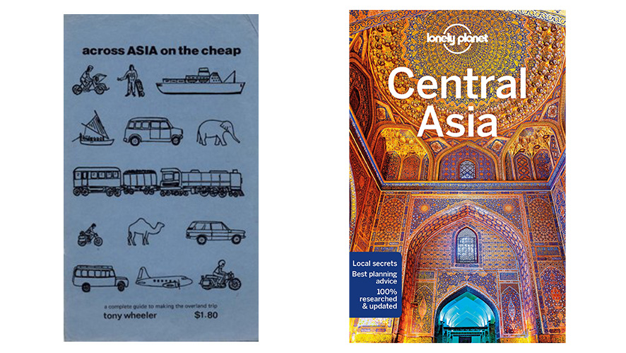
I worked for Lonely Planet for 5 years, and Typefi is used by all the world’s largest travel publishers, so I’ve seen how travel publishers are leveraging this concept to generate more sales.
Here you see two Lonely Planet travel guide covers. The first is an old cover from 1973, and the second is a modern cover from 2024—which one is more likely to make you pick up the book?
With so many options now available on the Internet, publishers need to be creating visually appealing content now more than ever.
Textbook on a bus
A significant number of Typefi’s customers use DITA for educational publishing.
When appealing to students, visual design shouldn’t just be there for the sake of it. It’s important that your visual design adds pedological value.
An educational publisher once told me the story of a two-page spread in a textbook he’d spent weeks designing.
One day, on his bus to work, he watched a student flicking through the same textbook, making notes. With anticipation, he saw the student reach the beautiful two-page concept. He watched as the student spent a minute on it, circled two points, and moved on.
A good design or an illustration should be more than just compelling—it should be useful. Time spent creating elaborate designs is wasted if the design does not serve its intended purpose.
The purpose may be to stand out in a bookshelf or a flick through. It may be pedological or to highlight critical information. It may be to create visual interest. Often it is a mix of all of these.
It’s important to clearly understand your goals when creating designs.
Accessible design
Accessibility is the design of products, services, devices, and environments for people who experience disabilities.
The goal of accessibility is to create an inclusive society where everyone—regardless of disability or special needs—can read, hear, and interact with content. It’s an important goal, especially when you consider how many people can benefit.
About 10% of the world’s population—650 million people—live with some form of disability. An estimated 253 million people live with vision impairment: 36 million are blind and 217 million have moderate to severe vision impairment.
About 81% of those 253 million people who are blind or have moderate or severe vision impairment are aged 50 and above. So, even if you don’t have a disability right now, it’s increasingly possible you could become temporarily or permanently impaired as you age.
When creating and producing publications and documentation, the accessibility of such publications must be of paramount importance. Accessibility features should be considered as an integral part of the design and development process.
What is good design?
Form is part of function. Good design is often seen as secondary to content, but it shapes the entire customer experience and can be the difference between success and costly mistakes.
Most people, even though they’re not trained in music, can pick up badly played music. Similarly, most customers will not pick up on a bad user interface or bad design, but they will recognise the product as hard to use or hard to understand.
Good design:
- Conveys critical information quickly and clearly.
- Draws the reader’s focus to important content, without having to read the whole page.
- Is compelling. Whether it be a textbook, user manual, or travel guide, any type of publication should be able to engage you.
- Matches the customer documentation to the product.
- Is accessible.
- Provides a seamless experience: it must be on brand.
Using DITA or any other XML schema does not mean you have to compromise on visual design. Many consumer products use DITA alongside a manual workflow of copying and pasting, importing and designing. But there is a simpler way.
Tools like Adobe InDesign are very compatible with XML and DITA. At Typefi, most of our customers use XML, and a large number use DITA.
We have decades of experience in everything from consumer-based travel publishing to technical publishing and textbook publishing—we can help you improve the design of your product documentation and reach that point where DITA meets design.

Chandi Perera
Chief Executive Officer
Chandi joined Typefi in 2006 and has over two decades of publishing and media technology experience. He has acted as a technology consultant to corporations and government agencies around the world and is a frequent conference speaker in the areas of content management, publishing, media, XML, structured content and digital rights management.
Chandi is a board member of several industry bodies and has degrees in Engineering and Computer Science.