There is nothing like a global pandemic to highlight the fact that not all information is available equally.
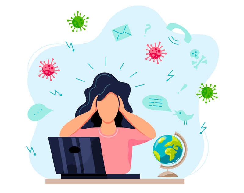
While we are being bombarded with more information than we can process, a lot of that information cannot be consumed at all by people with disabilities, because it has not been produced with accessibility in mind!
I know that a lot of us who advocate for accessibility can be quite vocal and active and possibly even a bit… obsessive… about what we do. Sometimes, I think that is actually detrimental to our message.
So, in this post I want to focus on the human experience, and look at some simple things that anyone can do when creating written content to make a difference for visually-impaired people who use assistive technology to read.
We’re all human after all
When helping Typefi’s customers produce accessible content, or when thinking about how we can improve the accessibility of our products, the work we’re doing can seem quite technical and distant.
But, in the end, not being able to read content is a human thing, and I sometimes forget that.
Last year, my family got a puppy. I was looking up some dog training videos when I stumbled upon a Cesar Millan video in which Cesar helps Molly Burke’s guide dog, Gallop, get over his fear of water. Guide dog, yes, because Molly is blind.
Cesar also did an interview with Molly where they talk about dogs and trust, and how much help a guide dog is for her.
Molly has a very popular Youtube channel where she shares insights into her life as a blind person, both good and bad. So, I started watching some of her videos, and it reminded me that accessibility is about being human.
Molly does a tremendous job of communicating this, and she has helped many young blind people through the wonderful medium that is YouTube.
For me, writing alternative text for an image or advocating for accessible content is about making a little difference for someone who may not be able to see the beautiful sunset picture I just took, or my goofy mud-covered dog after a rather successful walk in the woods.
Or it’s about making a big difference for someone who is looking for information on this COVID-19 situation and cannot find it, because the summary they want to read has not been prepared with accessibility in mind.
Someone I don’t know, but who has the right to be informed just as much as me.
Simple things we can do in Word
We can’t all be accessibility experts, but we can all do little things to make a difference.
I am a firm believer in the mantra that some accessibility is better than no accessibility.
So, with that in mind I’d like to show some simple things you can do in Microsoft Word that will help make your output more accessible.
As a side note: I know Word is not the only word processor out there, but it is the most widely used worldwide, and recent versions actually produce a pretty decent accessible PDF. That said, the basic principles I discuss hold up for any word processor you use.
I have also ordered the items from most important to “nice to have”.
Use Word’s built-in heading styles
Sighted readers can see what a heading is because it usually stands out in the flow of text, with a slightly larger font and possibly a colour. But if you can’t see, headings are vital because they are the only way in which you can infer the structure of the document and get a quick overview of what it talks about.
The built-in heading styles in Word have an attribute that identifies them as a heading, which means people with a screen reader will be able to navigate and read the content more easily.
Every single template in Word has built-in heading styles for Headings 1 through 6, so there should be something to suit your taste. For maximum accessibility, make sure that you nest headings correctly.
Bonus tip: Ctrl-Alt-1 through 6 or Cmd-Alt-1 through 6 applies Headings 1 through 6 in Word without needing to find them in the Styles panel.
Add alt text to images
So, what is alt text, or alternative text? It so happens that there is a blog post from our friends at textBOX about the merits and importance of alt text, so go ahead and read that quickly before coming back here.
Adding alternative text in Word is easy: right-click your image in Word and choose Edit Alt Text. The screenshot below is on the Mac, but it works exactly the same on Windows.
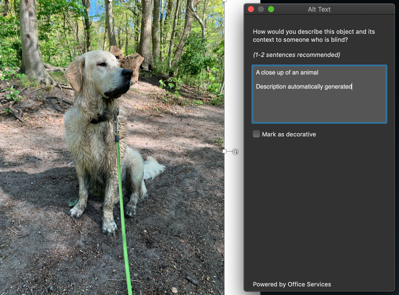
As you can see, Microsoft uses Office Services to generate some alternative text for you, but you can replace it with whatever you want (which is important, because artificial intelligence doesn’t always get it right).
I tried to find the version of Word where they started doing this, but they label everything as Office 365. I believe it started with Word 2016.
What does the Mark as decorative checkbox do, you ask? Sometimes you may have a picture that conveys no additional information, like a line between paragraphs or a small graphic in your header or footer.
If it conveys no meaning, marking such an item as decorative means screen readers will ignore it and users of assistive technology will have a smoother experience.
Use actual bullets and numbers
Bulleted and numbered lists are such a visually important method for clarifying points, making steps, and so on.
But if you don’t use automatic bullets or numbering, that same importance gets completely lost to users of assistive technology! Screen readers will read your list as regular paragraphs, losing all meaning.
Don’t type a bullet or a dash or a number followed by a tab. Use those bullet and number buttons in the Word toolbar!
Use table headers
Screen readers require a header row to be present in your tables. So, make sure you set that up properly in Word by:
- Selecting the number of rows you want in your header;
- Right-clicking anywhere in those rows and choosing Table Properties;
- Switching to the Row tab;
- Selecting the option Repeat as header row at the top of each page.
Make hyperlinks descriptive
Imagine I am writing a short passage about the benefits of brushing your teeth twice a day and I want to point the reader to a blog post from my dentist. Having the full URL is usually not very useful.
Can you imagine having a screen reader read “w-w-w-dot-nameofmydentist-dot-com-slash-somesubpage-slash”? I think you get the drift.
When inserting a hyperlink in Word, you can choose to have descriptive text display, just like the links in this article.
Add a descriptive title
Filenames are usually not very descriptive, so it is useful to include a title that describes the purpose of the document, as this is the first thing a screen reader will read.
- On Mac: File > Properties > Summary tab.
- On Windows: File > Info, then view the Properties area on the right. If you click Show All Properties you get a bit more.
While you are here, fill out any additional information you feel is helpful, like a summary or some comments.
Do an accessibility check
Word offers an accessibility checker that will help you identify some issues. Though it is by no means comprehensive, it will help flag situations where alternative text is missing or filled with machine-generated content, and where table headers are missing, to name a few.
For both Mac and Windows, click Review in the ribbon and select Check Accessibility before you generate your PDF.
Generating your PDF
Word for Mac and Word for Windows have two different methods for generating an optimised PDF.
For Mac:
- Go to File > Save a copy;
- Choose PDF from the list of formats;
- Make sure to select the radio button for Best for electronic distribution and accessibility (uses Microsoft online service).
For Windows:
- Go to File > Save as or Save a copy;
- Click More options;
- Choose PDF from the list of formats;
- Click Options;
- Check Create Bookmarks using Headings (only available if you used actual headings in your Word file) and keep all other options the same.
Congratulations!
You have just produced your first tagged PDF with improved accessibility options!
But wait, what’s a tagged PDF?
When producing a tagged PDF, every item in the PDF has a tag identifying what it is.
For example, I wrote this blog post in Word using everything I describe in it. If I then open the PDF in Acrobat Pro you can see the tag tree.
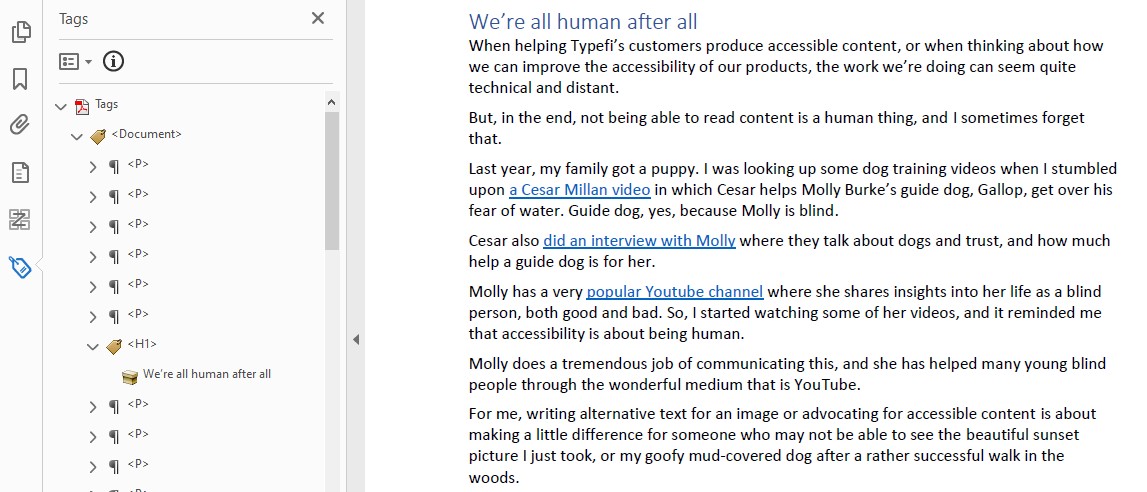
You can see that there are <p> tags for paragraphs, but the heading We’re all human after all is tagged as an <H1> heading. This means a screen reader will know that it is a heading, and that brings us back full circle to why all the structural elements we apply to our Word document are so important.
To a screen reader, an untagged PDF is just one big blurb of text with NO identifying characteristics, which makes it very hard to consume.
It’s like reading a book, but with everything in the same size font, no page numbers, and no chapters to indicate when something begins or ends.
Let’s face it, a document with no structure is probably not something a sighted person would want to read. It’s the same for visually-impaired readers.
Conclusion
If you have to do all of this for the first time, it can seem like a bit of effort. But I hope you agree that these tasks aren’t too difficult, and with just a couple of steps we were able to improve things significantly.
Eventually, as you continue to keep accessibility in mind, you will start incorporating these steps from the beginning whenever you write anything at all—it will simply become second nature.
You may never know if your content is being read by someone who is visually-impaired, but you can always be secure in the knowledge that you’re creating a better experience for your fellow humans!
About Guy van der Kolk
Guy first got hooked on publishing while attending an international school in Ivory Coast, where he used Pagemaker, Photoshop and an Apple Quicktake 100 camera to help create the yearbook. After many hours of hard work, while holding the final printed product, he knew this was an industry he wanted to be a part of.
Having spent the first 17 years of his life in West Africa, Guy is fluent in three languages and has a multicultural background that has served him well in his career. As an IT consultant and trainer for an Apple Premium reseller and now as a Senior Solutions Consultant for Typefi (based in the Netherlands), he has spent nearly two decades training thousands of people to get the most out of their software.