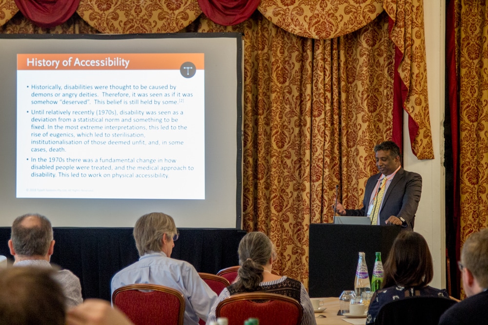
Chandi Perera, Typefi CEO, opens the Accessibility Workshop at the 2018 Typefi User Conference with an introduction to accessible publishing.
Transcript
CHANDI PERERA: I’m presenting the first session, just to talk about accessible publishing, what it is and how you can get there.
What is accessibility?
So, what is accessibility? I found two definitions. The first one was: “The design of products, services and devices and environments for people who experience disabilities.”
It’s important to note that it’s products, services, and devices. Most of us here are making publications, so that’s a product. We are providing an information service. I think there’s at least one architect in the room, so I suppose the environment does apply to at least one person in this room, but otherwise, this is really our job for most of us.
There’s another definition I saw which appealed to me, which is: “Accessibility is the ability to access and benefit from something.”
So, accessibility to a building or a room is the ability to enter the building and benefit from the resources in there, physical accessibility. Similar things apply to books, services, and information that we are providing.
What is disability?
This talk is about disability, and I’ve been trying to find a definition. I found a very good one from the WHO that talks about disability as an umbrella term covering impairments, activity limitations and participation restrictions.[1]
An impairment is a problem in a body function or structure. An activity limitation is a difficulty encountered by an individual in executing a task, so if somebody’s trying to read information, and they can’t. Or participation restriction is a problem experienced by an individual in involvement in life situations. That’s a disability.
The history of disability and accessibility
So, accessibility is aimed at people with a disability. Let’s just look at little bit about history of accessibility and disability.
As I was preparing for this presentation I actually ended up reading way more books than I thought I would, and one of them was around history of accessibility and disabilities.
Not so long ago, I’m talking 300 or 400 years ago, disability was kind of seen as something that was deserved, that God gave you, or it was a demon or a deity. And that belief unfortunately is still held by some people.[2]
Until relatively recently, I’m talking the 1970s, disability was seen as a deviation from a statistical norm—there’s an ideal human being, and disability was a different kind of separation from that.
This led to some very strange thought when you take that line of thought further. It’s an undesirable trait, so it led to things like eugenics where people with disabilities or people who are prone to have disabilities were sterilised or institutionalised, or in some cases killed.
This is not always a wonderful background, but in the 1970s there was a very substantial change on how disability is looked at as a medical issue, and how it’s approached in terms of accessibility. Initially, physical accessibility—like being able to get into buildings, being able to use buses, trains, things like that.
That leads me to the history of accessible publishing. That’s actually a bit more nicer history I suppose, if I can put it that way.
So, you can keep going back. There is lots of information, but I decided to start around the 1800s and the modern publishing world.
Braille—I’m sure everybody here knows what Braille is—was developed in 1824, published in 1829 by Louis Braille.[3]
Actually, it was based on a system that was originally of the French military called night writing. Napoleon wanted a system where his soldiers could read messages without light at night and without having to speak, and the night writing system was developed for that.
It actually totally failed in that approach, but Louis Braille found out about that and expanded on it.
Now, one of the challenges for the Braille system was it was long thought at the time that having a different writing system for people who are visually impaired was not ideal because it would separate blind people from the people who are not blind. Also, the teachers had to learn something new, which was difficult.
So, the tactile reading or Braille, having a different alphabet, wasn’t considered optimal.
About the same time Louis Braille was developing Braille, the New England School for the Blind was founded in Boston, Massachusetts in 1829. It was originally called the New England Asylum for the Blind, but it changed to the New England School for the Blind and now it’s called the Perkins School for the Blind.
They actually developed a tactile system of writing as well. It was called Boston Line Type, and it was founded at the school and used embossed simplified Roman alphabet.

I’m not sure if you can see that, but when you can see the slide pack, you can actually read it. It is comprehensible for someone who’s not visually impaired. The letter forms are very close to Roman letter forms.
So while this was happening, in New York—just down the road now, but a bit more then—they also developed a system called New York Point. It was definitely a different coding system or a different character system than the Boston Line Type.
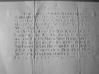
It actually used dots, so very similar to Braille, and it used a little machine called a Kleidograph which you used to produce it without having to use a stylus. It was much easier to produce.
They used this in the US well into the 1800s and sometimes the 1900s. If anybody here knows the Little House on the Prairie books, Laura Ingalls Wilder, her sister was actually taught this system.
That’s what that looks like, and it looks very different.
So, time continues on. In 1856 there was a school in Texas in very much the wild west called Texas School for the Blind and Visually Impaired that opened.[4] They actually didn’t have their own writing system. They originally used the New York system, and then they adopted Braille.
About the same time on this side of the pond, the RNIB—or what is now the RNIB—was founded. It was the British and Foreign Blind Association for Improving the Embossed Literature of the Blind. That was the original name. It was a bit of a handful.
The meeting was held in London. There were four people at the original meeting for the original association. They renamed and rebranded a few times. Amazing read if you go to their website on their journey.
They were very much big proponents of Braille, so in 1870 RNIB adopted this format for the blind in the UK. The original Braille used the French alphabet, so the English alphabet was adopted. They actually developed an Arabic code in 1889, and in 1893 they had a dictionary of Braille.
Braille has been quite strong in the UK for a long time, but talking of the UK I can’t leave one out, which is Moon. I’m not sure if anybody is familiar with the Moon code.
Dr William Moon was born in Kent. It was developed and published around the 1843, 1845 period. It’s actually based on, again, a tactile format, but it uses a simplified kind of Roman character set.

It’s still used in the UK. You can go to the RNIB or Vision Australia or Canada and borrow books in Moon.
It is actually thought to be a better system for teaching, helping people read who have lost sight later in their life, so they don’t have to learn a new alphabet, or people who are movement impaired. So, this system is still used, not widely used, but it is used.
But both Braille and Moon have kind of declined in the last, I suppose, 20, 30 years with the advent of DAISY and more technology, sophisticated formats.
What is accessible publishing?
Accessibility enables everyone, regardless of disability or special needs, to read, hear and interact with content.
For us, I think that is the challenge and that’s the target. The goal of accessibility is creating an inclusive society for people with visual, auditory, physical and cognitive disabilities.
When we are creating our products, we should be thinking of not just the able-bodied or the able reader, but also the disabled reader.
So, we speak to all our customers, we speak at a lot of conferences, and actually this is a discussion I had about six weeks ago with a very large group of publishers, and they said, “Oh, I’ve just realised our country has adopted this new treaty called Marrakesh Treaty!” (Which you’ll find out about in a minute.)
“We have a legal requirement to make our content accessible. This is what we do, so what can we do at the end to make it all accessible?”
And we said, “Well that’s not really going to work very well.”
You have to start at the beginning, and we’ll go through this as we’re going throughout the day, but you need to start thinking about accessibility right at the start of the process. Not just the publishing process, but the commissioning process. Otherwise right at the end there’s not much you can do.
It’s a bit like saying: “I baked a cake. There’s somebody with a nut allergy in the room. What can I do to the cake to take the nuts out of it?”
That’s really not going to work. If somebody’s got a nut allergy, you need to actually think about them before you make the cake.
So, who needs accessibility? There are people who are visually impaired. It’s not just blind—it’s partially blind or low vision, colour blind, people who have photosensitive seizures, people who are deaf, or have hearing impairments.
There are physical disabilities, paralysis, movement impaired issues, and cognitive impairments, so not being able to understand what’s being read even though they might not have visual disability or auditory disability and so on.
And some people will have multiple disabilities, so they might be deaf-blind. Giving somebody a screen reader who is deaf-blind is not really going to help a lot because they won’t be able to hear what’s going on.
Why publish accessible content?
So, with those people, why would you want to make accessible content? I’ll try my best at a justification.
You know, almost everyone, everybody in this room and everybody you have met, would be at least temporarily or permanently impaired at some point in their life. It could be that you break your leg, and you’re in a cast and you can’t walk for a few months. It could be that as you age, you lose your sight or you lose your movement, or it could be something else.
But 10% of the world’s population today, 650 million people, live with some form of disability.[5] And to put that in context, the population of the EU is 508 million people. So, more people than who live in the EU live with some form of disability.
253 million of these people live with a vision impairment. It could be a mild vision impairment. They could be totally blind—there are 36 million who are totally blind. 81% of people who are blind or have moderate to severe impairment are over the age of 50.[6]
But more than that, between now or 2015 and 2030, the number of people over 60 will grow in the world by 56%—901 million at the bottom end, 1.4 billion on the top end. That’s the size of China.
By 2030, if you’re not having accessible product, it’s like not publishing to a group the size of China, the Chinese population. By 2030 older persons, so people over 60, will outnumber the 0–9 age bracket, and by 2050 they will outnumber the 10–4.[7] This is a segment that you need to focus on.
Let’s ignore ethics for a minute. This is a huge market. It’s a huge market of people who lived and earned money, and who now have money to spend, who are used to having access to information.
Let’s bring in ethics again. We are thinking about ignoring a significant chunk of the world’s population if you don’t make this content available.
About 90% of the material that’s published today cannot be accessed by people who are visually impaired, according to the World Blind Union.[8]
Our goal as publishers should be to actually have that down significantly, because think about it. We will be in that age bracket by 2030. I think everybody in this room would be in that age bracket, and imagine only having access to 10% of the information you have access to right now by that time. You are setting yourself up by doing this.
Of course, all of that aside, there are some regulatory requirements. You know, money doesn’t matter, ethics doesn’t matter, well, the law should probably.
So, the regulatory requirements, one part here, the UN Convention on the Rights of Persons with Disabilities.[9] It’s a convention, so it isn’t law per se, or legislation in a country, but it is about promoting accessibility.
One of the points I want to highlight here is develop it at a minimum cost. It is not asking you to go and send your publishing operation bankrupt, but you should be looking at accessibility if you can do it at a reasonable cost.
If you look at the convention, there are 173 signatories to it, so almost every country in the world has signed it and ratified it. And there’s an optional protocol at the back of that, a complaints mechanism, that has also been signed and ratified by 92 countries. About half the countries in the world have ratified a mechanism for actually actioning complaints under this treaty.
Looking a bit further, there is actual legislation. I’m not going to go too much into this because there’s a session later talking about this. There is national legislation in all the parts of the world we operate in, and these are some of those that talk about accessibility.
In Australia it’s the Disability Discrimination Act. In the UK it’s the Equality Act. In the US there’s a few of these—there’s the Americans with Disabilities Act, Section 508, which is a standard and a piece of legislation, which is interesting.
In Europe there was originally a European Accessibility Act which was proposed in 2012. I don’t think it went through, but there’s the Marrakesh Treaty that actually has 88 signatories, and 37 countries have ratified it, including the European Union.
What all this means, my colleague Emily will talk about later, but there is definitely some legal requirements. If you don’t like the ethics and the money, there’s definitely the law.
Key features of accessible content
For all of that, what are the key features? How do you make something accessible? What do you need to do?
The first, most important, thing is consistent and coherent writing. Last year, starting about April last year until about a month ago, I read a lot. I normally read about probably 30, 40, 50 books a year because I fly a lot, as most of you know, and in a plane you read, otherwise you go mad.
Last year I decided I’m going to stop reading on my Kindle, and I’m going to start using a screen reader on my phone to actually have books read to me to see what it was like. I could do that while I was walking or jogging or doing something else.
They were well-edited books. And sometimes you buy a two dollar book from Amazon, or a 99 cent book from Amazon. I wouldn’t really call it coherent, consistent writing in some of them.
Especially if you have something like a run-on sentence, and you’re looking at it, you can read it like twice over, you can read bits of it and kind of reconstruct the sentence in your head, and you can extract meaning from it.
If you’re listening to it, you can’t skip back to the start of the sentence and the middle of the sentence and the end of the sentence and try and figure out what it means, so by the end of the sentence you’re totally confused because it wasn’t properly edited. It wasn’t really properly thought through.
So, it is really important to have coherent and consistent writing.
The best example for this is just go and buy a 99 cent book from Amazon, ideally something that doesn’t have a high rating. Use your screen reader or EPUB reader on your phone—just listen to it, and you won’t be able to figure out what’s going on in the book.
Correct semantic structure is important, so Heading 1, Heading 2, Heading 3, Heading 4. Not Heading 1, Heading 4, Heading 3, Heading 1 because it looks good on paper, all right? The structure is important because structure is what helps you navigate the document.
Alternative text for figures is important, and it should be meaningful alternative text, not: “It’s a picture.” Ooh, great. I know it’s a picture or it’s a chart.
Proper identification of language. This is something we forget because when you get a book, when you open a book, if you are an English reader or French reader, you know it’s an English or a French book you’ve read, and you know the language you speak. You can read it.
But when the same book is opened by a screen reader, the screen reader needs to know what language to interpret it in. If you haven’t told it explicitly that this is in French, it’s using the Latin alphabet, so the screen puts that in English, and it’ll start using English dictionary, and it’s going to sound really strange. Or German, or any of the Latin languages.
So, make sure of proper identification of language. It’s not a huge thing. It’s something very easy to miss, but if you do that, it is going to make life a lot easier further down the line.
Resizable text obviously doesn’t work on paper, at least not yet, but digitally, yes, resizable text is great. I am actually finding this myself. We were having discussion with my colleagues yesterday. We went to a restaurant. I was having trouble reading the menu as I’m getting a bit older, but with the Kindle I’ve noticed that I’ve been setting my font size higher and higher and higher, and that’s great.
Proper colour contrast is important, as in so many times I see like a light blue with a yellow text on top of it, a restaurant menu, and you are literally there going, “You know?” And I would not consider myself visually impaired, but if you can’t read it, colour contrast is important.
Headings. Using headings to outline content is useful, very, very, very useful because it’ll help you navigate through there.
Less tables. If you’re providing complex information in tables, make sure the tables are structured properly.
Also make sure your tables are not set up as images in the output because you want to get that perfect tint of purple in the table and you can’t do that in HTML, you make an image out of it. Well, now you can’t read it, so make sure your tables follow, especially complex tables, they are actual tables that can be navigated.
Print is still one of the most popular and easily distributable formats. It’s probably, well, from a technical point of view it’s not a very accessible format, but for being able to deliver it, it is a very accessible format.
You can deliver it anywhere because of technology’s sophistication. You can print it. You can deliver it to the middle of nowhere. There is no power, either in a disaster zone or somewhere that’s very remote, and that makes that information accessible. So don’t ignore print.
There is a very good publication from the RNIB called See It Right.[10] And by the way, all of these things I’m talking about, there’s a list of references or further material. When you get the slide pack, there’s URLs for all of these.
It’s a good book, it’s a brilliant book for designing for accessibility of print design. Some of the things it covers, and this is by no means extensive—use high-contrast colours for text and background.
Print is most readable in black and white. I know sometimes we’d like to have some colour in that and differentiate ourselves, but black and white is best. The more black there is in the text, less black there is or colour there is in the background, the better it is to read.
Keep the text large. Avoid complicated or decorative fonts. Screen readers probably wouldn’t care about decorative fonts, but if you’re trying to read it and you have low vision, decorative fonts make it very difficult to read what’s going on.
Use matte, non-glossy finishes. It cuts down on glare, again for people who have low vision.
There’s a lot more recommendations on there, on the publication. I’m not going to go into any more of that because of time.
HTML
HTML should be compliant to WCAG—that’s the acronym for Web Content Accessibility Guidelines, or WCAG 2.0, developed by the Word Wide Web Consortium. It’s commonly accepted as the standard for accessibility.
There’s three levels of conformance.[11] There’s A, AA and AAA. Depending on how you prepare content, what you do with it, you certify to one of these levels. Obviously A is good, AA is better, AAA is the best.
Now you don’t have to say everything has to be AAA, and I’ll cover that in a minute, and conformance to the standard is based on four principles.[12] Is it perceivable, operable, understandable and robust? What do I mean by that?
Perceivable. You need to provide alternative text for non-text content. So if you have images, charts, you need to provide alternative text for that. And if you are a publisher, like most publishers we work with, production is not the right stage to add alt text.
Alt text should really be added by the originator of the content. The person who put that chart there, or that image there, should be able to say: “This is why I put that image there.”
If an editor is trying to add that, they are trying to now understand what the author meant when they placed it, so it’s always important to try and get the alt text as early in the process as possible.
It’s also going to make life a lot easier for that person because they will know exactly why that is. They don’t have to guess because they’re the ones who put the content there in the first place.
Provide captions and other alternatives to multimedia. Create content that can be presented in different ways. So, if you have a beautiful infographic, which is great if you are fully sighted, but maybe create an alternative of that for people who are either partially sighted or blind so they can get the same information.
Make it easy for users to see or hear content. Now we go to websites, and I had an example, but I didn’t want to show it, they had some text, some of just free flowing text followed by an image that they had embedded because they wanted a certain look for the next chunk of text and then the rest of the text.
A screen reader wouldn’t be able to read that image. It looked good, but was totally useless for trying to use the screen reader on it. Make sure whatever you are doing, it makes things accessible.
I’d like to give a shout out to Shanna who’s out the back. She has been doing this for our website for the last year I think, and we are almost at AAA.
There are still bits that are out there. It is a lot more difficult than you think, especially if you’re using an off-the-shelf content management system and an off-the-shelf theme that really wasn’t accessible when they built it, and you’re kind of trying to wedge this in. It is a bit of work, but it’s definitely worthwhile.
Talking about operable. Make sure it can be used with a keyboard. I’m not sure if Caleb’s in the room, or Ben. They are working on making our server accessible—that’s one of the big pushes because accessibility is important for us.
We are putting that through all our products, and we are finding that certain things on our server cannot be accessed using a keyboard. You have to have a mouse. So, when you find that, we are fixing that.
Give users enough time to interact with it. Don’t start bugging them, saying: “You’ve been looking at this for 10 minutes or three minutes, you need to move on, or I’m going to time you out.”
Don’t use content that could induce seizures. I think a lot of people know this. I know HTML still has the flash tag. Don’t use it. But again, there’s a lot of material on this from the W3C.
Help users navigate the content. Make sure that there’s easy navigation built into your content you’re building.
Make the text readable and understandable, goes without saying.
Make the content appear in predictable ways. This bank in Australia—and actually, it’s a bank I bank with, which makes it even more annoying—their idea is when you log in, you type in your internet banking number, and to do the password they have this keyboard that randomly jumps around the screen so that a keylogger can’t capture what you’re typing.
But there is me randomly trying to punch the button. It is the most frustrating product, and it’s been featured in a number of case studies on accessibility, so you can look it up.
But it is definitely not predictable, and sometimes you feel like, especially if you’re trying to do that on a phone or a tactile device, as it’s jumping around it’s really annoying. With a mouse you can kind of try and follow it.
Help users correct mistakes or avoid mistakes. If you’re walking them through a part, make sure they have a way back if they press the wrong button, because sometimes if they have movement impairment, they might be moving up and down, thinking about something like Parkinson’s.
And very important, maximise compatibility with current tools. If you build this great website, and it only works in Chrome, and everybody knows Chrome’s the best product, and why would you not use Chrome? It’s free!
Don’t do that. Make sure people can use it all the other platforms. This is one of my pet bugbears, so make sure when you create something it is accessible that way.
DAISY
Anybody here who know what DAISY is? DAISY stands for Digital Accessible Information SYstem. It’s a talking book format. It’s fairly oldish now, it’s about 15 years old, but it’s developed and maintained by the International DAISY Consortium. It’s a NISO standard.
It doesn’t preserve layout. It is not about layout, it is about presenting an audio book, or text-to-voice. Still very widely used, especially in places like Australia and the UK, you will still find a lot of older people with DAISY readers who are getting their newspaper as a DAISY file every day. They’re getting their magazines in DAISY file every day.
In Australia, the organisation Vision Australia still converts a newspaper into DAISY every single day, and the DAISY file is then distributed to their members. So, DAISY is very widely used.
It’s kind of trending away from it because DAISY version 4 and EPUB version 3 is the same file format. So, technically any EPUB 3 reading device should be able to read a DAISY file.
I mean ‘technically’, because there are plenty of devices in the market that can’t do that. Definitely the top end devices can, but there are a lot of devices out there that claim to be an EPUB 3 device, and you try to load a DAISY file with the DAISY information in there, and either it fails or it totally ignores it. So it’s a little bit of a way to go there.
EPUB
There’s EPUB—peaked about two years ago, and kind of plateaued since then, so it’s no longer the cool kid on the block. It’s a ZIP file of content. It’s like a small website, you know, contents, HTML file, CSS style sheets, screen readable.
If you make a WCAG 2.0 document EPUB file with the WCAG 2.0 guidelines, you more or less end up with a very accessible file.
Lots of devices can read this, so you can distribute it, read it. It’s a widely adopted format, and EPUB readers are everywhere. Accessibility is built into the standard.
It’s up to you as a publisher if you want to use that. For example, one of our customers sent us this textbook. It was accessible, but the alt text in all of those images just said “alt text”. So it was technically conformant, but it wasn’t very usable.
If you are going to make something accessible in EPUB 3, try to make it genuinely accessible, not just pass conformance testing because it’s very easy to pass conformance testing without making something accessible.
As I mentioned earlier, EPUB and DAISY standards have harmonised, but many EPUB readers lack the feature compatibility to actually make it accessible for EPUB 3.
Who here still distributes PDF files? Yeah, quite a few, and to be honest, the market for PDF is going back up again because funnily enough, there’s been a lot of research done in the last few years that talk about a page as a kind of a representation of information is very important, which you don’t get in an EPUB or a website.
A page is something that you can navigate through. It’s a great navigational device, and because of this, PDF is kind of hanging on and gaining some ground again.
You can make a PDF document readable. Even if it’s multi-columned and beautifully designed, you can still give it a reading order and a tag order so screen readers know how to follow through it. I think my colleague Guy is going to cover all of that later.
But if you create the PDF correctly, you can make it fairly accessible. There’s actually an ISO standard on this, wonderful ISO, it’s ISO 14289:2014, and it’s got a really long title which I’m not going read out, but that’s the standard that covers PDF/UA.
The good thing about PDF/UA is you can create a single PDF file, you can put it on your website. People can download it and print it, and if they’re not visually impaired, that’s all they need to do, or they can download it and look at it.
If you are visually impaired, you can download it, put it into a screen reader, and it serves that dual purpose of being an accessible file and a normal printed file.
Now, if you can reuse that same content and create a DAISY file or EPUB file, you’ll be more accessible. But if you only have the budget to create a PDF, try and make it an accessible PDF.
Accessible publishing standards
Just touching on some of the standards again. There’s WCAG 1.0, which came out in 1999, superseded by WCAG 2.0 in 2008.
There’s the Section 508. So how many people are here from the US? I see a few faces. So, in the U.S. we hear all about: “Are you Section 508 compliant.” If you sell to the government, you have to be Section 508 compliant. If you do certain things, you have to be Section 508 compliant, so it’s actually a set of regulations and a set of standards.
I mentioned the ISO, the PDF/UA already. Large print and clear print guidelines from the RNIB. These are not formal standards, but it is something you should be looking at following. I talked about DAISY, and I’ve talked about EPUB 3.
Accessible versus usable
I just want to take a little segue at this point. I’ve given a few cases where accessible is not always usable. And you can, as I keep saying, you can pass conformance testing, and you can make a really good attempt at it, but it might not be usable.
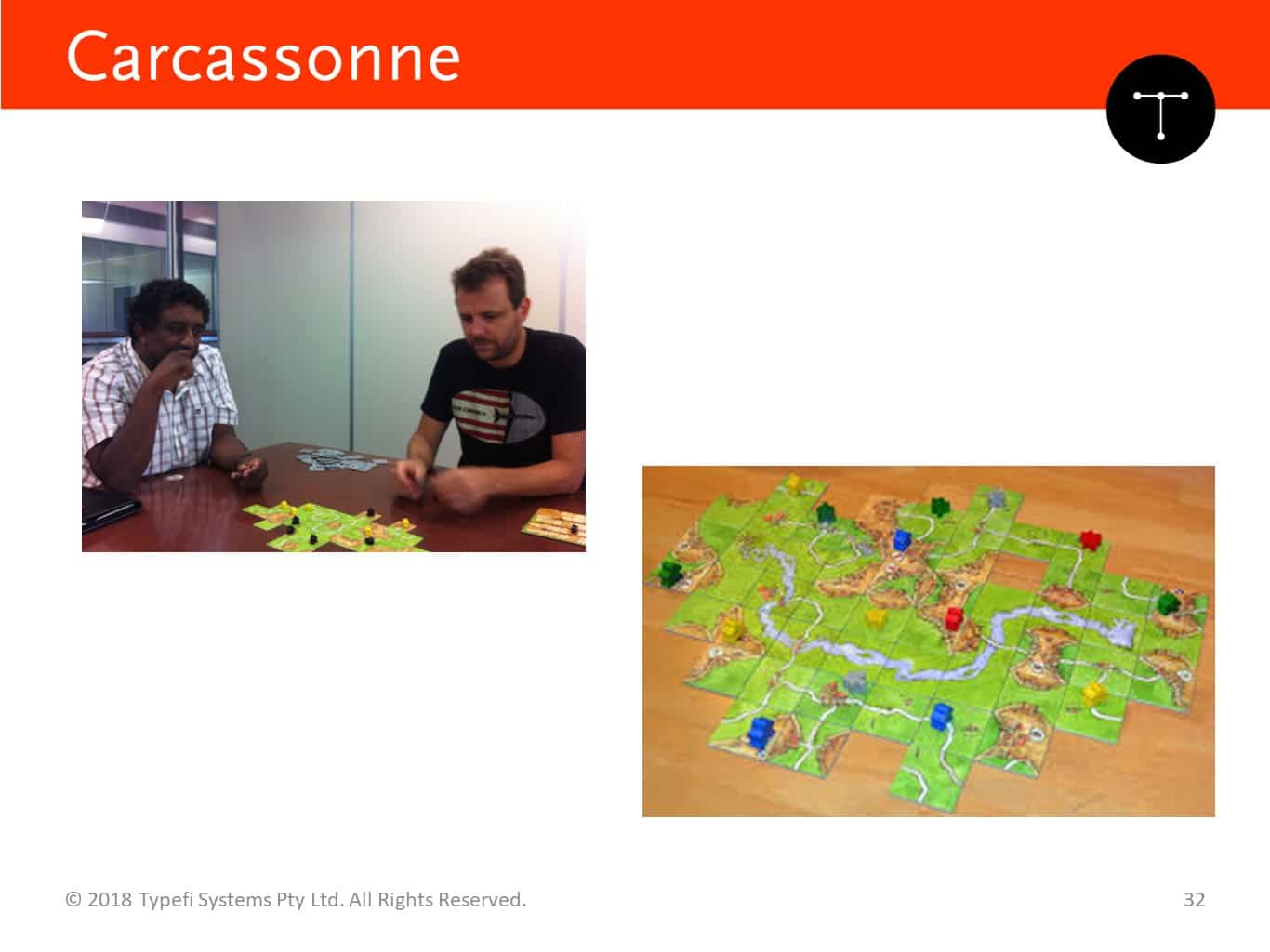
I’ll give you an example. So, this is our office. That’s Ben, he’s our head of engineering. In the office we play a game called Carcassonne, a board game. That’s the board game, and we play it, I don’t know, about once a day. Whoever’s in the office joins in.
We keep track of our scores. And generally, Shanna wins all the time, but this is the scores from last year. That’s on a white board.
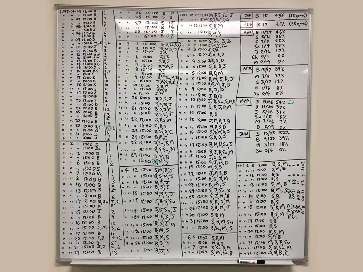
Now I’ve decided to put that onto a table. This is the results from March, April and May last year. Fairly easy to follow, you know who won.
The person who wins the month brings a cake in for the end of the month or the start of next month. So you know who brings the cake in and all of that. It’s really obvious, and it’s done by percentage because not everybody’s in the office all the time.
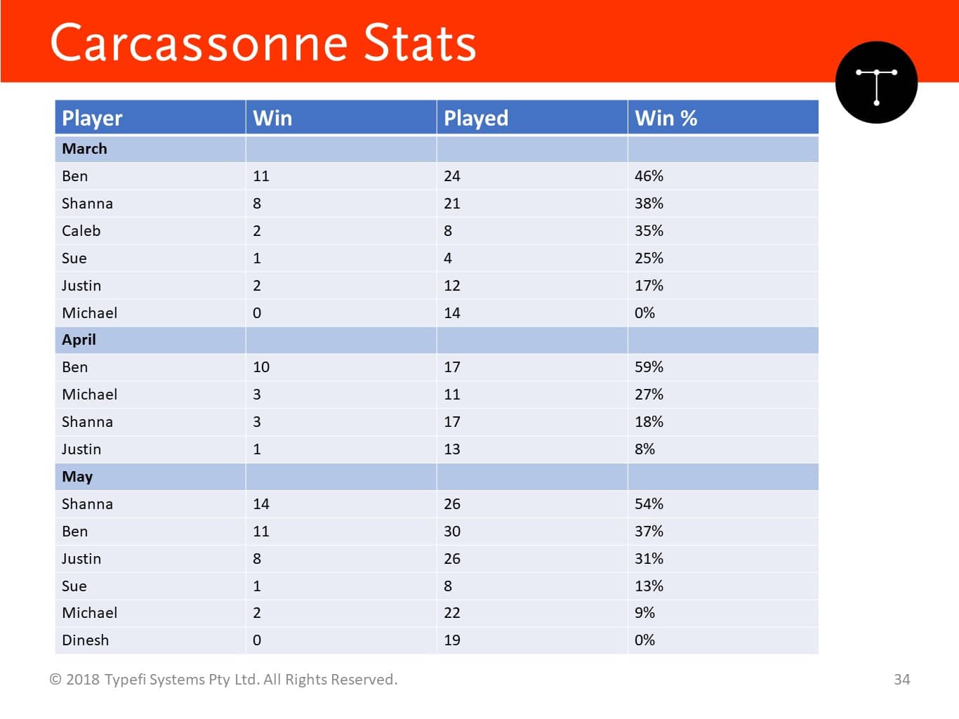
Table 1: It will take 19 clicks with a screen reader to find out how many games Michael won in May.
Now, you’re visually impaired. You want to find out how many games Michael won in May. So, what you need to do, is your screen reader’s going to be starting in the top left-hand corner. It’s going to be reading “player, win, played, win percentage”.
So now I want to navigate by player, so you’re going to click your button. When it says “player”, it’s going say “March”. Not interested, click again, then not interested, and click click click click click click click until you get all the way down to here, and then click along the side.
That’s a long list to work through to get there. If you are not visually impaired, you know exactly what subheading to go to.
The challenge is, tables have no concept of subheadings. The navigation on tables do not follow subheadings. We know that’s a subheading, but for a screen reader that’s just something with a blue background and bold text.
So, using subheadings in tables will cause this problem. And this is not a big table. This is a relatively small table.
How can we fix that? Well, we can split that into three tables. That’s one way, so there’s a table for each month.
Or you can do something like this, where we can add another column, merge the column down.
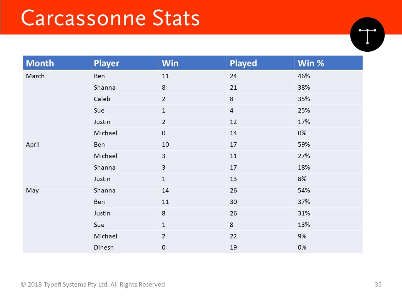
Table 2: It will take eight clicks with a screen reader to find out how many games Michael won in May.
So this one, you start the screen reader, it says “month”, yes, click. “March”, no, “April”, no, “May”, yes. Next one. “Shanna”, no, and you navigate to “Michael”.
I counted this out earlier. It’s eight clicks here, 19 clicks in the previous one, so you save half the effort for a screen reader by adding that extra column.
There are a lot of things you can do to your content to make it more accessible and more readable.
Where to next?
You need to decide on your level of conformance. Make sure it’s realistic. Look around your organisation, you know, you all have a day job, so you should be looking at accessibility. Decide what you’re going to do. Decide how much you’re going to do it, and set a realistic set of goals.
One single format cannot meet all your accessibility needs. Try and do a few formats if you can. Consider producing as many outputs or many different types of outputs, as long as cost is feasible.
Ensure the content is accessible and usable, not just accessible because it’s very easy to pass the accessibility checker and get the tick. But if you do that and you claim something to be accessible, somebody’s going to end up in your content and get totally lost, and your brand is going to suffer.
Some accessibility is better than no accessibility. I’ve heard this so many times from the research we’ve conducted, where people are saying: “Yes, you haven’t reached AAA, but this is so much better than what it was last week when it was a scanned PDF or a screen-reader-non-friendly PDF.”
So definitely some accessibility is better than none.
Thank you. Here’s the further reading. At this point I will ask if you have any questions.
ATTENDEE: Hi. Just being slightly perverse and awkward, you can sometimes have a tension between different accessibility requirements.
So, you’re saying that for partially sighted readers you want maximal contrast, black and white. If you have dyslexic readers, you do not want maximal contrast. You want high but not maximal. How do you kind of balance those?
CHANDI: I would create two different files. That’s what I would do. I would create one that has a high contrast file, and one that doesn’t have high contrast.
If you’re in a digital environment, if you’re in a website, have two different CSSs where they can switch.
For print I would actually create two different PDF files, one with one set of fonts and style sheets, either in InDesign, or in our case you would use two different templates in Typefi. That’s how we would solve it.
If you don’t have Typefi, you just lay it out, go in there, change your paragraph style settings and your character style settings, and just get a different look. That’s the ideal way to solve it.
If you don’t have the budget for either of them, try to find a middle ground. Again, don’t choose like light blue on yellow. Just find a ground that’ll work for both, but ideally create two specialist ones.
Further reading
- Disabilities. World Health Organization.
- Stiker, Henri. A History of Disability. Ann Arbor, Michigan: University of Michigan Press, 2000.
- Braille, Louis. Method of Writing Words, Music, and Plain Songs by Means of Dots, for Use by the Blind and Arranged for Them. 1829.
- A Brief History of Tactile Writing Systems for Readers With Blindness and Visual Impairments. Texas School for the Blind and Visually Impaired, 2006.
- World Report on Disability. World Health Organization, 2011.
- Bourne RRA, Flaxman SR, Braithwaite T, CicinelliMV, Das A, Jonas JB, et al.; Vision Loss Expert Group. Magnitude, temporal trends, and projections of the global prevalence of blindness and distance and near vision impairment: a systematic review and meta-analysis. Lancet Glob Health. 2017 Sep;5(9):e888–97.
- World Population Ageing Highlights. United Nations, 2015.
- Marrakesh Treaty Ratification and Implementation Campaign. World Blind Union.
- Convention on the Rights of Persons with Disabilities (CRPD). United Nations Department for Economic and Social Affairs Division For Inclusive Social Development.
- See it Right: Making information accessible for people with sight problems. RNIB, 2007.
- Web Content Accessibility Guidelines (WCAG) 2.0. The World Wide Web Consortium (W3C), 2008.
- WCAG 2 at a Glance. The World Wide Web Consortium (W3C), 2011.

Chandi Perera
Chief Executive Officer | Typefi
Chandi joined Typefi in 2006, and has over two decades of publishing and media technology experience. He has acted as a technology consultant to corporations and government agencies around the world, and is a frequent conference speaker in the areas of content management, publishing, media, XML, structured content and digital rights management.
Chandi is a board member of a number of industry bodies and has degrees in Engineering and Computer Science.