In this presentation from the 2018 Typefi User Conference, Guy van der Kolk, Typefi Senior Solutions Consultant, demonstrates how technology can make accessible publishing easy—and maybe even fun!
Transcript
GUY VAN DER KOLK: Good morning, everybody. Let’s do some light stuff, after all the legal talk.
In all honesty, I have the best job in the world, because when you guys have finished figuring out what kind of accessibility you actually want, it’s my job to actually make it work for you. And my job is actually quite easy, as you will see.
So, what I’m going to be talking about is this statement. All right?
But there’s a but.
And we’ve been talking about that all day. Everybody who came before me, we’ve been talking about what you need to do in terms of effort to get your authors to actually write their very important stuff with accessibility in mind. And it happens everywhere.
I’m going to quickly switch to Safari, and I’m going to do one of my favourite searches.
They change, so you have to be careful. I personally really like this one.
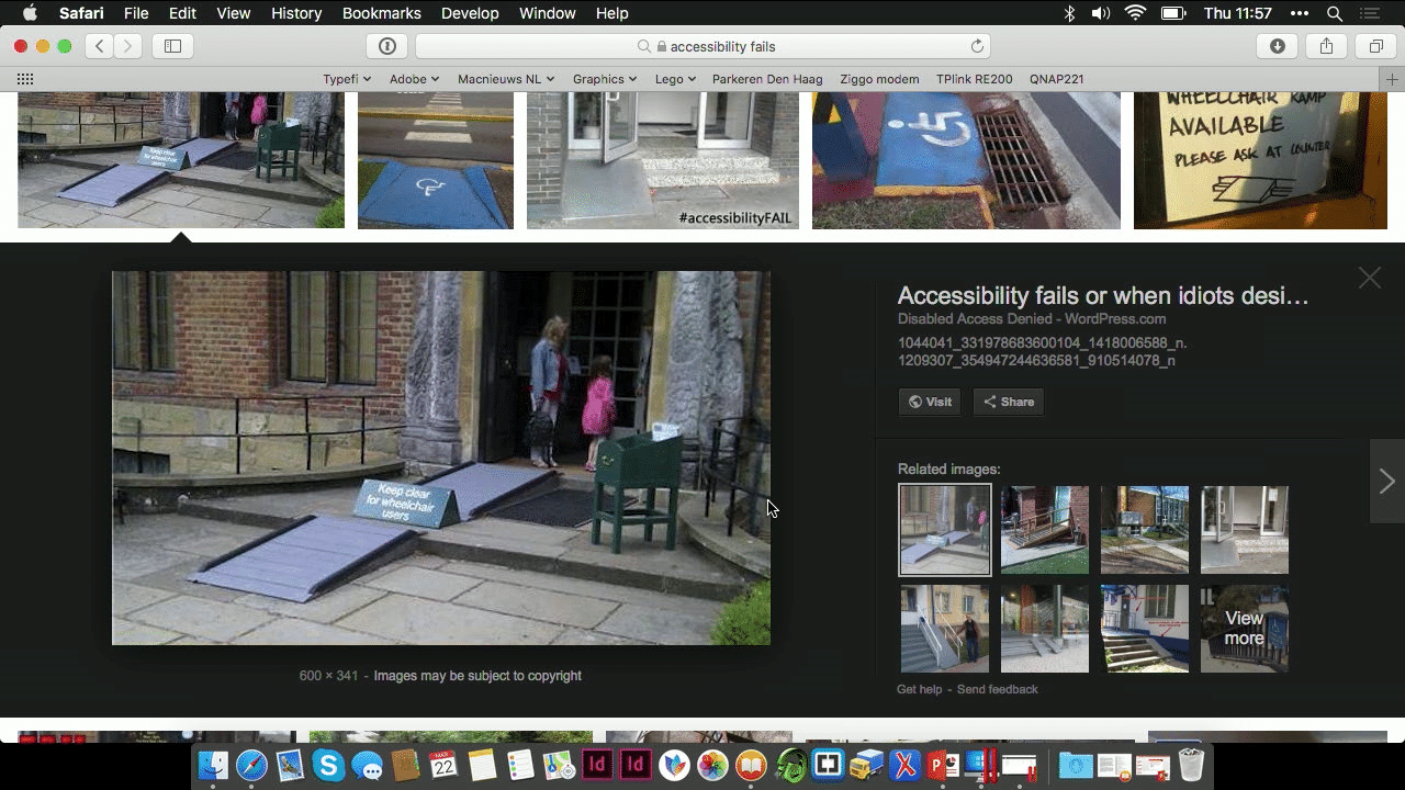
I hope everybody can see it. But it essentially says “keep clear for wheelchair users”, which is always very, very useful. I mean, the thought was there. You know, they thought about it. But the execution could have gotten, you know, done a little better.
But it’s the thought that counts at the end, and I think that’s the theme that we can summarise from the presentations that went before me, that accessibility, you have to start somewhere.
And yes, maybe you’re not going to achieve AAA status because no chart or table would ever pass AAA accessibility and still meet the requirements of the author, but you start somewhere, and you think about not putting the sign in the way.
So who am I, and why am I even allowed to speak about this subject?
My name is Guy van der Kolk, as Chandi said, and I’m one of the Senior Solutions Consultants at Typefi. I’m colour blind, and I speak three languages, two of which are in the UN set of languages. So that’s a big advantage.
Colour blindness, you may not think about it, but my wife came home one week. She’s in financial services and they had the end-of-year document that companies need to do, and she was so excited about all the work that she did to make it a beautiful presentation, and they had built beautiful tables.
And I’m red-green colour blind, and I’ll give you a guess what colours they used to show positive or negative in their tables. So, for me, all her excitement was absolutely great, but I couldn’t see whether they’d done better or worse than the years before.
It’s those little things that we don’t think about. In Holland, you all know that when you push the buttons at the red lights that it starts making a sound, which is very useful if you can’t actually see the red lights.
But in my municipality, after 11, they stopped, because people in the area were complaining about the noise, because of course only once every couple times does an actual blind person cross the street, but the rest of the time you do have that very annoying sound.
Which just also goes to show how unsupportive we may be of the impaired person’s inner life.
Anyway, I’ve been part of several multilingual and multi-format projects, one of which was—my first one, actually—Simon at ITU, which instantly transformed me from just a Solutions Consultant to a Senior Solutions Consultant. Just the way it goes.
Accessible formats
Let’s quickly review some of the formats that we’ve talked about earlier. What are the accessible formats that you can choose from?
I’m actually going to show you some of them, and I was going to do the text-to-speech, but other people have already done that today.
We’re going to be talking a little bit about PDF, HTML, EPUB, and DAISY, and I will be showing you how easy it actually is to make these formats.
I’m not going to show you all of these formats, because I only added accessibility to my presentation for tomorrow last night, so I wasn’t able to whip up EPUB and DAISY at the same time, but theoretically, I could have, if I wanted to.
So, let’s review a little bit about PDF. We’ve already been talking about that it’s not necessarily the most accessible format, but it is the most widely used format.
I’m completely ignoring print, because that’s already been talked about a lot. I’m just talking about a little bit more of the digital formats; so, PDF as a downloadable file.
But even if it’s not the most accessible format, with the combination of content and post-processing, which I’ll be showing you in a while, you can produce a PDF that is much more accessible than it would be by default.
And, of course, I have the big advantage of working for a single source, multiple output company, which means that whatever work you do in your input file, you have the advantage in all of the formats that you produce, including PDF.
We’ve talked about alternative text and all that other stuff, and cross-references and hyperlinks, which allow you to navigate your document more easily. So, PDF. I’m not going to show you anything about PDF. In a while, but not right now.
HTML
The next accessible format is HTML, and we’ve been discussing about where is the future going to go? Is it EPUB? Is it HTML?
We’ve been talking about how many mobile devices people have, and in all honesty, my mobile phone is the first thing I go to if I want to look for content, and I was just discussing with somebody, I don’t even download apps anymore if I can avoid it.
Like my Dutch news, they have a perfectly responsive website, so why would I download an app to watch the news if I can go to an HTML website?
But HTML also represents one of the key things that make Typefi work so well—the separation of content from how it looks. HTML describes the content; CSS describes how it looks.
I’m going to show you a very old website. CSS Zen Garden is one of those websites that has been around for ages, and it illustrates the concept of content separation from how it looks brilliantly, because all it does is, it gives the same content…
Whoops, sorry, that’s not what I meant to do.
It gives the same content.
It’s really small, so it’s, it gives the same content…
Oh, there we go. Well, it doesn’t really.
Okay, I’m going to show this slightly differently then. I’m going to go to my Develop menu, and I’m actually going to disable the CSS. So that says Disable Styles. Now, all of a sudden, I’m just looking at the plain HTML.
Normally what you’d have seen if I clicked on the button and it worked—I think the screen is too small, not entirely accessible—then you would have seen that the content would have remained the same, but its look would have changed every single time.
This is one of the big, big advantages of HTML, other than the fact that it is a format that almost all of our mobile devices can see without needing to download any additional applications or things.
So HTML is a really important part of content strategy, or at least it should be.
Now I am going to switch back to my presentation.
EPUB
Now, if we’re talking about EPUB, EPUB has some accessible features as well.
Most importantly, well, we’ve already seen the read-out-loud, but one of the questions that came up earlier today is the question about dyslexia and colour contrast. One of the beautiful things about EPUB is that you can choose your own font.
I read an article three weeks ago where there is a special font that was developed for dyslexic people. One of the options could be you have two different PDFs with different kinds of contrast, or, if you provide an EPUB, then a dyslexic person could choose their own font.
And, of course, you can increase and decrease the font size, which has already been discussed.
If you’re going back to single source, multiple outputs, then generating an EPUB makes instantly your content more accessible, because people have these choices of choosing a different font.
You know, Google has recently come out with a font that they spent a lot of time increasing the digital readability of that device for, sorry, not Google, Amazon, of course. Anyway, so that’s EPUB.
DAISY
And then there’s DAISY, which we talked about previously before. You know, DAISY is essentially, again, an HTML format, just as EPUB was, and it is wrapped specifically for DAISY readers.
As we saw earlier, right now, or one of the things that hasn’t been discussed so far is that DAISY is trying to move towards EPUB 3 as a format or as the main format for readability, but there is still a large number of assistive devices out there that still require older versions of DAISY.
So, DAISY as a format is still very, very much applicable as Chandi very, very eloquently told me when I told someone that DAISY didn’t matter anymore. I was wrong. Anyway.
But DAISY is actually the least forgiving format of them all.
We have been talking so far about what you can do to do your accessibility, and we’ve been talking about options—you can do this way, you can go that way.
If you are producing DAISY, then you do not have a, how do you say that? It’s not an advice to have your headers in the proper content order, you must; otherwise, there is no DAISY.
If you don’t have alternative text in your pictures, this picture has no alternative text, no DAISY.
Tables are properly tagged. They have to be properly tagged. No DAISY. Anyway, you get the picture.
Ideally, DAISY should therefore be the very first kind of format you produce, because if you can produce a good DAISY, then all the other formats will follow suit.
Now, who here will produce DAISY as the first format? Nobody. It’s always PDF, because that’s where the money is made. That’s where everybody becomes very, very happy.
One of the things that Chandi was showing this morning was that, in his slide, he talked about what can we do to help you make your content accessible? So, if heading structure is important, what can Typefi do to help you make sure that you don’t use a Heading 3 followed by a Heading 1?
That’s pretty much the end of my slides, because I’m a live demo sort of person.
Oh yeah, this is the slide that we were talking about, perceivable, operable, understandable, and robust.
Helping Typefi users avoid accessibility mistakes
So, one of the things that was on there was help users avoid and correct mistakes, right? So that’s what I want to show you right now, because it’s a theme that we’ve been working on, and I’m taking a small sneak peek at my validation session of tomorrow, but it’s so relevant for the kind of content that we’re doing here that I felt I’d pick it up today.
So, what I’m going to be showing you is, like I said, I was working on my demonstration for tomorrow, and I hadn’t put any accessibility in.
So, I was like, okay, it would be really cool to show how easy it is to add accessibility. And again, keep in mind, I’m only focusing on PDF because that’s all the time I had, but it doesn’t matter, because this Word file that I have on my screen right here could just as easily be used in a Typefi workflow with the information that’s in there to produce the other formats.
What we’re going to do here is, like I said earlier, the heading structure is important. So, what can we do to allow you to see that the header structure is important before you need to produce a DAISY file?
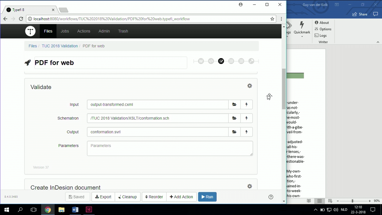
One of the things that we have been working on, and I will explain the terminology more in my system tomorrow, but I’m just going to talk about Schematron. Schematron is a very technical term that allows us to enforce structure—us, you as a customer.
So in this case, what I have done is in my workflow, and, you know, you’re all Typefi customers, so I can show you quite easily, in my workflow. The Schematron feature is as yet unreleased, that’s why this is my pre-release demonstration files.
Schematron is not something that is available yet for you as a customer right now, but it will be very, very soon, at some point in the near future, to quote Adobe.
I have a Schematron validation in here, and that Schematron validation specifically looks for, ‘Is a Heading 1 not followed by a Heading 2’ and so on, and so forth.
What I’m going to do is I’m going to go back to my Word file, and in the heading structure, I’m going to make this one a Heading 3. I’ll actually run the job right now so you can see that it’s working now, because right now, I have the correct structure. And while that’s running, I take a quick sip.
Right now, my content is perfect, because of course I’ve been working really hard on this content. And it’s going to run through, and it’s not going to fail. While that’s running, I will actually change the heading structure, and I will make this a Heading 3.
The job is running. It didn’t fail my Schematron. So, obviously, I’ve got my correct heading structure.
So, I’m going to go back to the Word file while that runs, and I’m actually going to change this to a Heading 3, Ctrl + Alt + 3, which is the keyboard shortcut. I love my keyboard shortcuts.
And I’m going to run the job again, and this time, obviously, there’s a Heading 3 following a Heading 1. So I’m incorrectly having the structure; therefore, I will not be producing a valid, accessible PDF.
So here’s the first one that got produced. I’ll talk a little bit about what I do to make it more accessible, but right now, I just wanted to show you the Schematron. The Schematron will have failed by now.
If I go to my Jobs view, let’s…
I didn’t click the right button. Click on Print. Excuse me. Sniffling my way through the presentation.
So, my job has failed, right? And like I said, this is an early beta version, so, you know, we’re still working on exactly how you get to see that when you’re working in Typefi Writer.
But, you don’t see your PDF, so you go look at the job, and we’re going to actually look at the logs, and we’re going to look at the Validate log, and we can see that there is a Schematron rule failure that says there’s an incorrect heading order.
Which means that using Schematron and using a rule, we’re now able to help you make sure that your content fits the requirements of accessible publishing before you actually go.
For the same thing, you could set up Schematron rules for making sure that your alt text has all been filled or things like that. We’ll go into a little bit more detail about that tomorrow in tomorrow’s validation session.
And of course, one of the beautiful things is that it also tells me which of my headings is not following the rule.
And the thing I like about Schematron is the errors you write, because you decide what you’re looking for, you also decide how you make the error, which means you can make it human-readable so that anybody can understand what the deal is, which is not always the case with validation.
So anyway, I can go back here.
You saw me running it before. You saw me change it to a Heading 3, so you know what that is. I’m going to change it back to a Heading 2.
All right, so what else do we have? You know, we were talking about accessibility. And in terms of accessible format, what can we do to this PDF, what can we do to this Word file to make it more accessible after we’ve helped you enforce correct content structure?
The next thing, of course, is like we said, alternative text. Now, in this case, I’m using a Typefi Writer workflow. How many of you use Typefi Writer? Can I get a quick show of hands? Not many.
The rest of you then would use an XML workflow, presumably? If you’re not using Writer, then you’re using an XML-based workflow.
In those situations, you would have your alternative text in your input XML, which you could transfer to a comment tag for your figures in CXML, and of course, that’s documented on the website. If you have specific questions, let me know. But I’m going to show it to you in Typefi Writer.
So I’m going to go and explore my document, which is going to open the document and show me all of the structure that has been added for Typefi.
And I’m going to actually look at the elements, and there are four figure elements, and in the Typefi Writer workflow, the simplest solution, the one that works out of the box, is that whenever you place a graphic in Typefi Writer, you are able to fill out the Comment field, which is then put as alternative text into InDesign. That works by default.
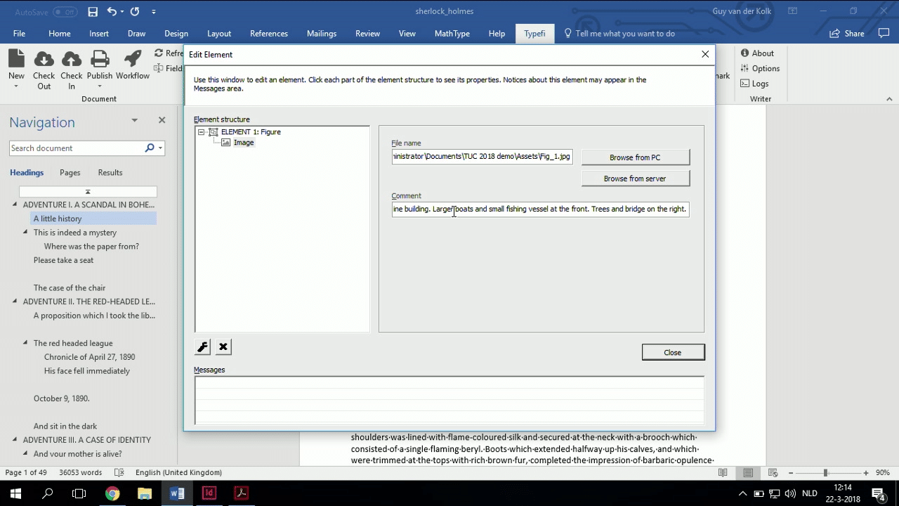
Like I said, if you’re doing an XML to CXML workflow, then it’s the comment attribute to the figure tag that gives you the same results by default, off the top of my head.
So now, I’ve done a conscious effort to try and make this (the alt text in the Comment field) as descriptive as possible.
So, I’ve put in my alternative text. I’ve made sure that my headings are enforced in the proper order. I’ve done a pretty good job of setting up on the content side. I’ve done a pretty good job of trying to make this as accessible as I can make it.
Let’s take a look at what we need to do on the template side, because of course, your content needs to be made accessible, you need to change some things on the template side.
What I’m going to do for the InDesign users in the room, I’m just going to briefly open up my template.
Like I said earlier, my job is brilliant, because I have it relatively easy, because making your content accessible, once you’ve done the work of putting in those alternative text and making sure the heading structure is proper, making an accessible PDF with Typefi is not a lot more effort.
So, what do I need to do? One of the first things that I need to do is I need to make sure that, in my paragraph styles, I need to define, because we’ve said it before, the headings are important. They need to be tagged as headings in the PDF that is generated, for the content order.
So, I need to make sure in my InDesign file that I edit each of the files that are going to be a heading and that, under the Export Tagging, that they are tagged as an H1, down here.
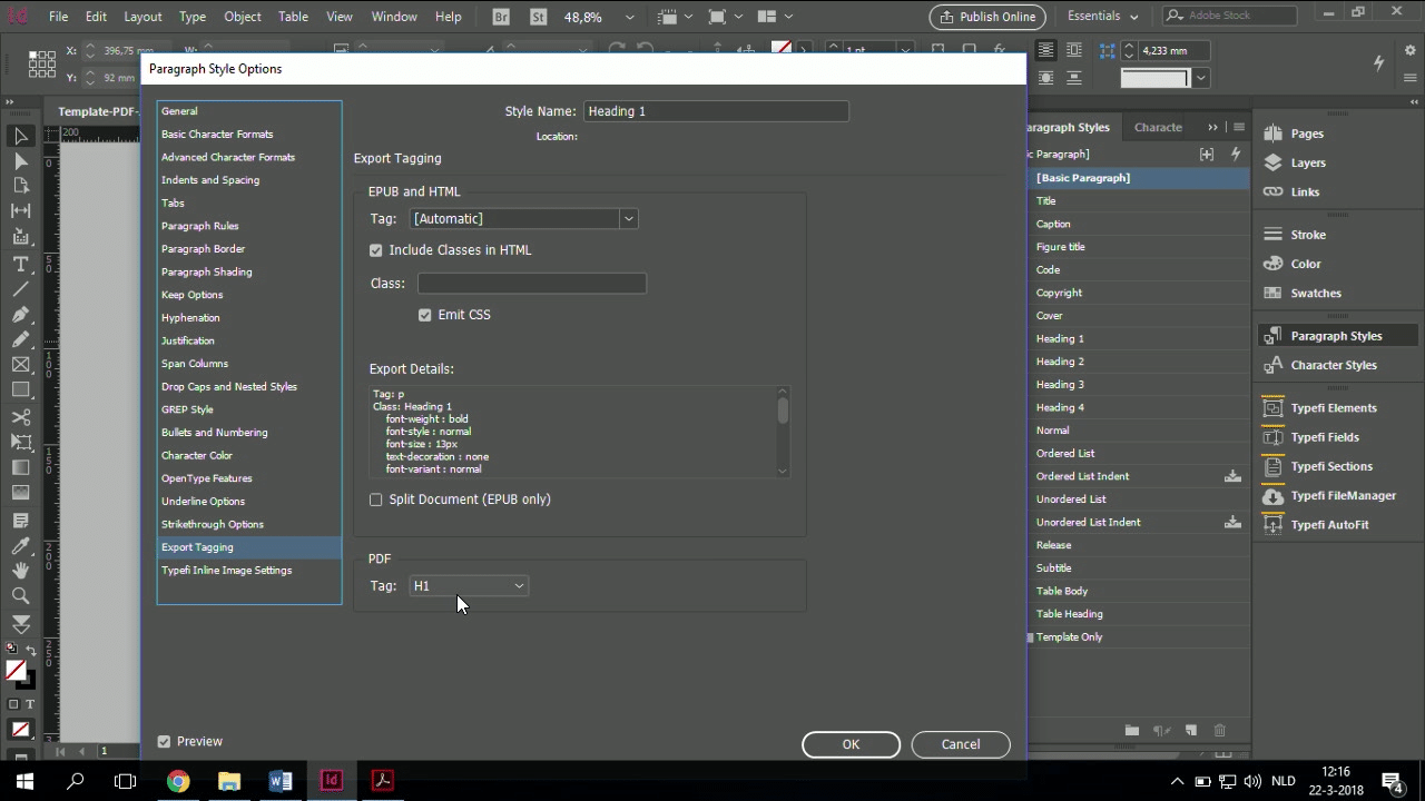
And of course, Heading 2, Heading 3. Now, in this case, I don’t have any titles and subtitles, so my Heading 1 is first, but if you have a title and a subtitle, then maybe you’ll want your title to be H1, your subtitle, H2, and then you go down. Anyway, that’s a lot of detail.
But I need to go through a couple of paragraph styles and determine which H tag I need to apply to them.
Like we’ve said before, I need to set my language. So if I’m looking at my paragraph styles, then I need to make sure that my… I forget where they are. There we go.
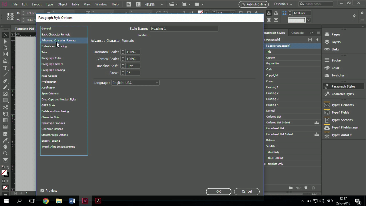
I need to make sure that my languages are correct, and at ITU and other multilingual publishers, what we do is we have a JavaScript that interactively changes all of the languages of all of the paragraph styles based on a project field that the customer fills in.
So they type in EN following the ISO codes, EN. In this case, it’s already English, so they do ES, I think, for Spanish, and then the JavaScript automatically changes all the languages.
One of the challenges that we’ve found that works very well, one of the challenges that we’ve found is in Arabic.
Not so much Arabic with English in it is not a big deal, because you can use character styles for that, but the combination of a full section of Arabic text followed by a full section of English text, so that means you’re doing both languages in one, that turned out to be a little bit more of a challenge than we initially thought. But it was also an exception.
So headings are an important thing.
Now the last most important thing is, as Emily said before, you need to define what is to be read by a screen reader and what is not. So the last thing that you need to do is you need to go through your content.
In this case, this cover is exactly as here. The only thing we add is the title and subtitle.
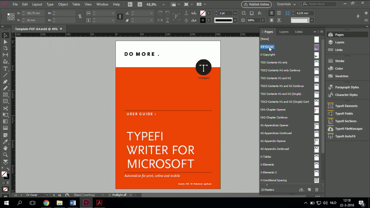
In this case, I need to analyse this file, and I can see that this is a graphic.
And this graphic is not placed in the Word file. It’s part of my content. This graphic, therefore, needs to have alternative text. So I need to right-click it. As part of my template, it needs to have alternative text.
So, I need to click it and I need to, did I select the right thing? I think I haven’t selected the right thing. I’ve gone and selected the content, and not the frame. Let me try that again. Yes, now I have the right thing.
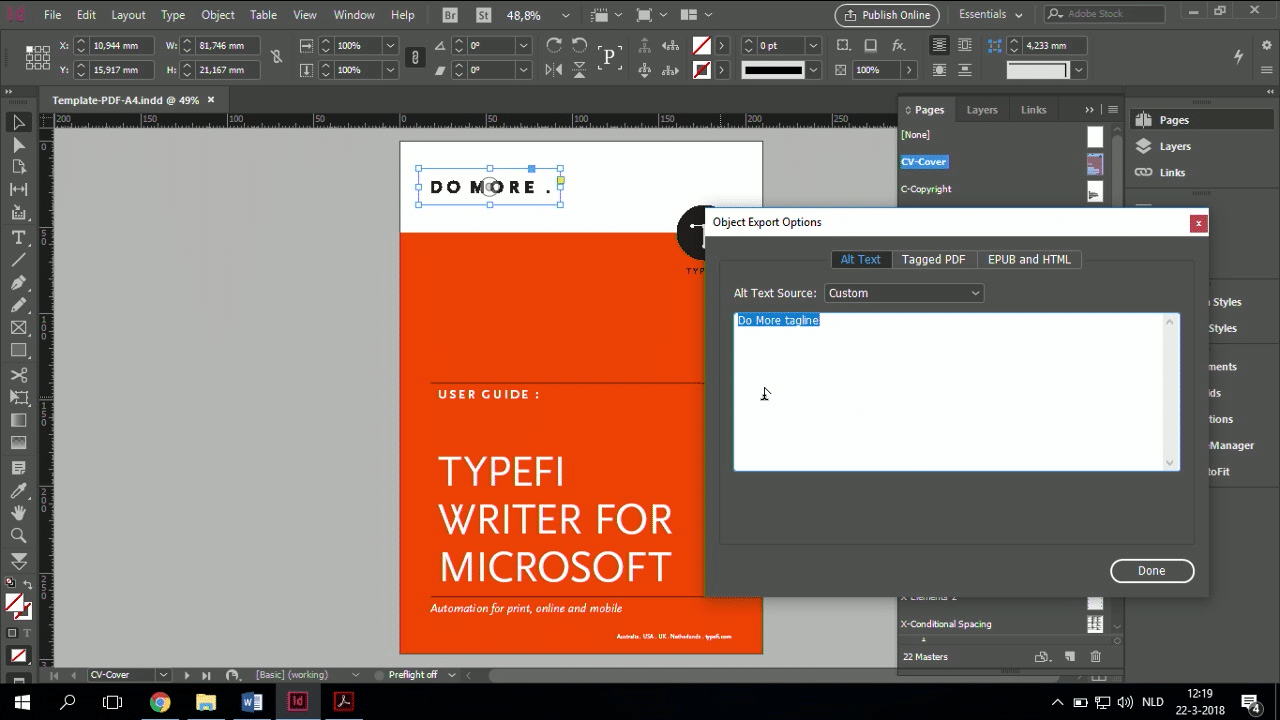
So here, I’ve, I don’t know if you can see it, but let me zoom in a little bit. I’ve added a description, ‘Do More tagline’, and I’ve taken the Typefi logo and I’ve added alternative text to that as well.
This is all on the template level, because of course, the graphics that are placed in my file, the alternative text comes from that comment field, or the comment attributes.
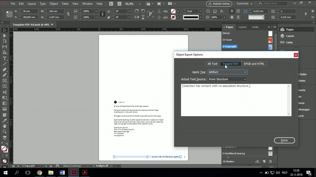
But the other thing you need to do is you need to describe something as an artifact. So if we’re going a page down, here, on this page, I’ve added alternative text to the little Typefi logo there.
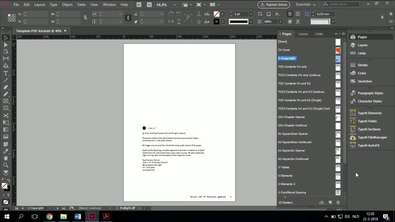
But the Australia, USA, UK, Netherlands, and the page number is, one could argue, irrelevant for a screen reader. You don’t want the screen reader to finish reading your page and then read for every single page, ‘Australia, USA, Netherlands, Typefi’.
The page number is one of those things where I think nobody will agree. That’s like Ford and Opel or Mercedes and BMW. Some people say the page number should be read. Some people say it shouldn’t be read. It doesn’t matter.
In the end, it’s your content policies that define whether or not you mark it as an artifact. In this case, I have.
How do you mark it as an artifact? You right-click (on the object), you go to the Object Export Options, and under Tagged PDF, you mark it as an artifact. That’s it.
So I went through this document last night, did the headings, and updated the artifacts, and added alternative text to images. And from a template perspective, my accessibility is done.
So, if I said it was easy, if you’ve already done all the work to design your template, adding on top of that a basic level of accessibility—so let’s say we’re aiming for single-A accessibility—then on my template level, I’ve done my content, I’ve done my template, so now there’s just the final thing that I need to do, which is my workflow.
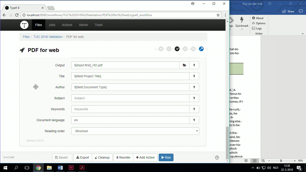
So if I go to my workflow. Of course, Typefi is already able to produce a regular kind of PDF, and it’s been able to do that for years. But now we want an accessible PDF, right?
So that means we need to do a couple of things to that PDF once it’s been generated by InDesign.
For one, we need to make sure that there is a title. For two, we need to make sure that there’s a language, and for three, we need to make sure that the title is the primary source of the documents.
Because otherwise, it is going to fail Adobe Acrobat Pro accessibility tests, which is the standard that I’m aiming for now. I want this file to pass Adobe Acrobat accessibility testing.
So, what we have is a set of plugins that is called PDFtk.
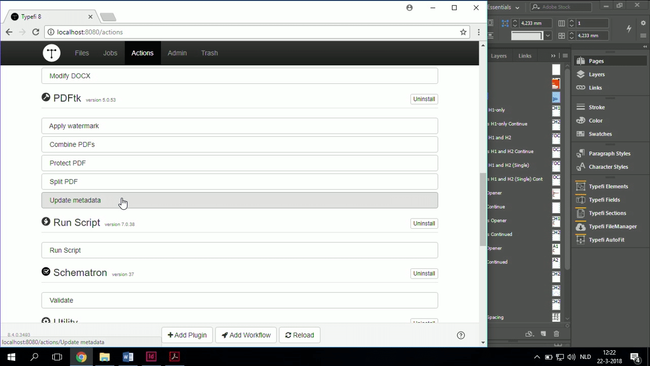
And PDFtk is a utility that allows you to post-process PDF files. In this case, there is an Update metadata action as part of the PDFtk suite that allows you…
As you can see here, I’ve got my InDesign file, and that produces an intermediate PDF, which is the thing coming out of InDesign with the proper settings, you know, the alternative text and all that other stuff.
Then there is an Update metadata post-processing step that I use to then take that PDF, and I add a title and an author. In this case, I’m taking that from metadata, but you could do it using fixed text if you wanted to. But the title, of course, you change, so you’d want to do that as metadata.
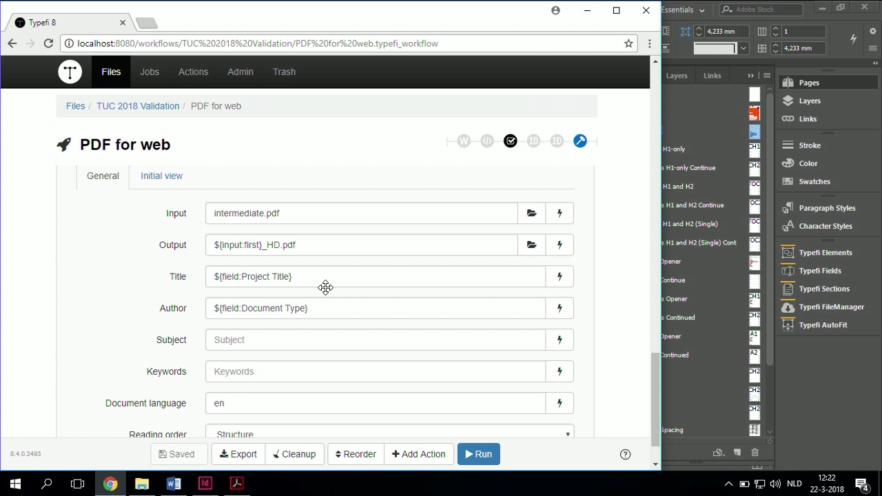
In this case, I’ve hand-typed the document language, because that’s the easiest thing to do. But in the case of ITU, of course, we need it to be dynamic, so we use metadata information to determine the language, so that nobody needs to go through.
The reading order must be ‘Structure’. If you don’t set it to Structure, the reading order won’t be proper, and it won’t be a proper tagged PDF, which means it won’t be readable by screen readers, which means you can’t do what Emily did this morning, reading.
That’s it. This action makes your content accessible.
So, what I’m going to do is I’m going to go back to my Word file, and I’m actually going to show you this PDF passing, hopefully, the Adobe Acrobat Pro accessibility check, which means that I have a basic accessible PDF. So I’m going to go to my published output, and I’m going to pick the last one.
As you can see, I’ve been doing a little bit of testing since this morning.
So, I’m going to drag this to my Mac, and I’m going to get rid of PowerPoint. I’m going to get rid of all the stuff, and I’m going to open my PDF, and not in Reader. So I have my big green button.
In this case, what I also did was I made sure that the bookmarks are properly set, which is what the PDFtk can also do, whether or not you want the bookmarks to show, which, in this case I have; whether you want the page to be zoomed in or scroll or things like that.
I didn’t show you that because they’re not requirements for an accessible PDF. Structure, language, and document title are, but you can do all of those things with PDFtk.
So I’m going to start checking.
So, you can’t see it, so I’m going to drag this over. Here we go. I have three issues. That’s not bad, given that I did this on the fly.
Apparently I have one alternate text issue. Let’s see which one that is. So, apparently, somewhere, I forgot to, oh.
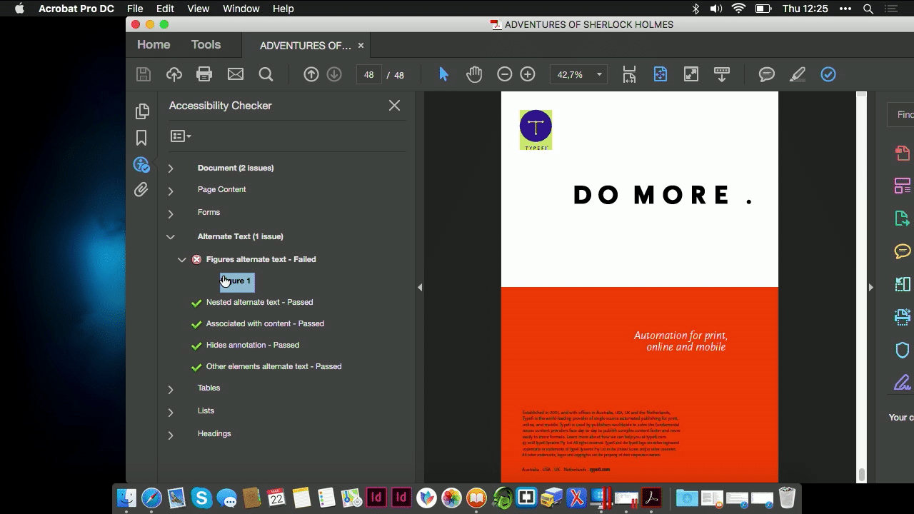
Drat. I forgot to add alternative text to the logo on the back cover. I could quickly go into my template and change that, but everything else has alternative text.
And I also want to talk at this point just a little bit about what we’re doing tomorrow in the validation session.
One of the things to think about when you’re testing, which is what we also ran into with the projects that I have been doing, is that if you have this PDF checked by a visually non-impaired person, so a non-VIP, then, they are going to hover their mouse over the image to wait for the popup of the alternative text to come up.
And then they’re going to tell you, why is it not, there’s no alternative text. There’s no popup.
Sometimes, when images have transparency or vector graphics, then there’s no popup. But a visually impaired or blind person is not waiting for a mouse to hover over for a popup to appear. The alternative text needs to be there.
So, the confirmation that alternative text is in your document is validating it with Adobe Acrobat Pro or using Schematron at the beginning to make sure that your content actually has alternative text.
When we’re testing this, and I know that ITU did that as well, they took their content, and they actually gave it to some people who had impairments, and they tested it for them, because they’re the end user. They’re the one that can tell you whether your content is good or not.
So, I’ve created an accessible PDF, just about single-A standard. Adobe Acrobat does not check all of the things that you need to do for a table, but this is already a lot more accessible than it was before last night.
And literally all I had to do was type some alternative text in Word, make sure that my headings are proper, and make small changes to my InDesign template and use PDFtk action to post-process the PDF file, and it’s accessible.
Now I could take this content and produce other formats from it, including DAISY without failures of alternative text and headings.
Questions
That’s it for me. Do you have any questions about this?
AUDIENCE MEMBER 1: You mentioned that the title is the primary source of the document. In layman’s terms, does that mean that the title tag has got the actual title of the document in it?
GUY: Yeah. So when you’re setting up your workflow, when you’re manually making an accessible PDF, one of the settings that you must change is you must go into the properties and set your initial view. Your Display Title must be Document title and not File name.
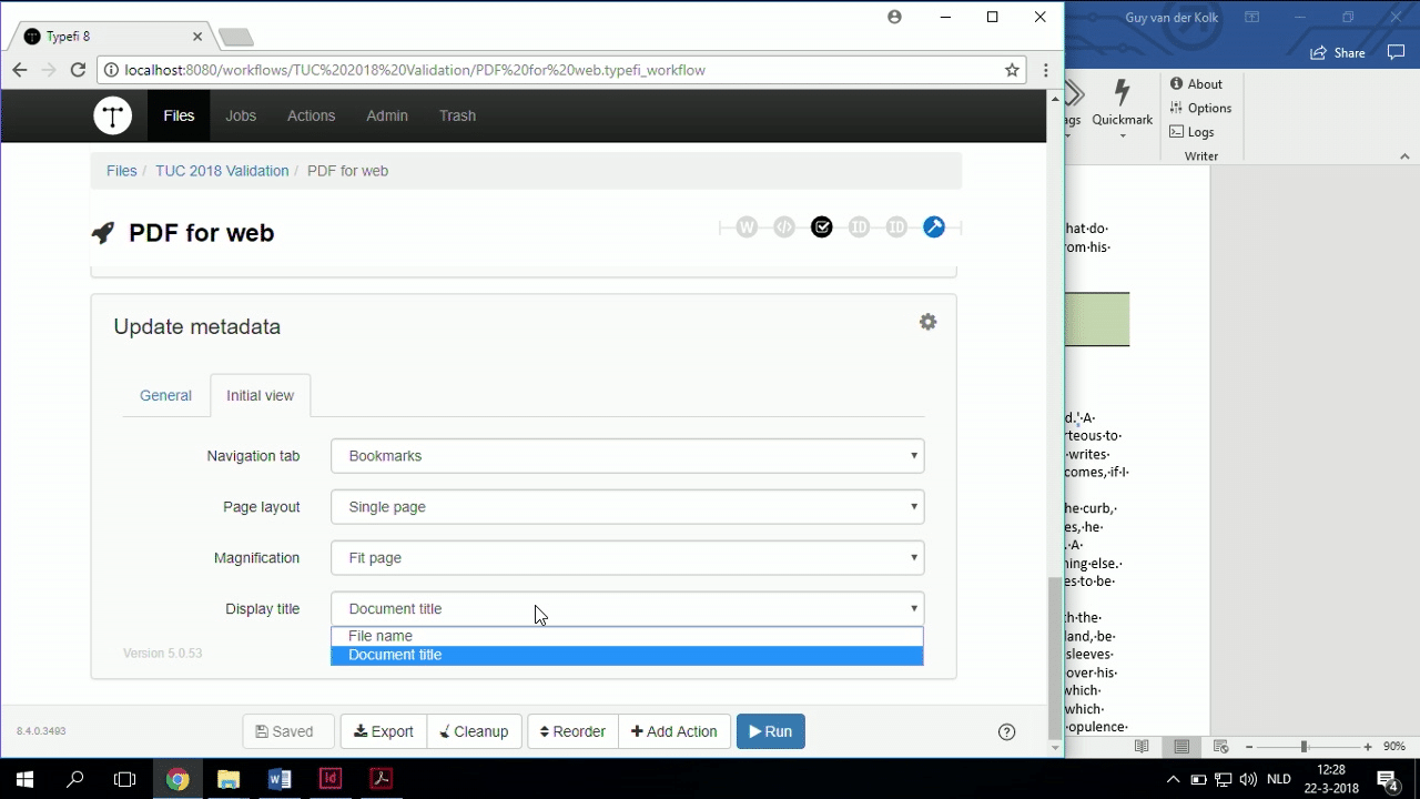
In our case, of course, we don’t want our customers to have to go in and manually change that after the fact, so that’s why we’ve got this PDFtk action. But in general, to pass accessibility, Display title needs to be set to Document title; content needs to be set to Structure.
You need to have a title obviously in the metadata, which we’ve already taken care of. Alternative text, heading structure, and so on, and so forth, all right?
AUDIENCE MEMBER 1: Thanks.
GUY: Thank you. Yep, go ahead.
AUDIENCE MEMBER 2: Well, it’s just a quick question about Schematron. I think you’re going to talk about it tomorrow, but is it something to replace Explorer, or it has nothing to do, because I have the feeling that it picks up mistakes and show you where it is.
GUY: We will talk about that more tomorrow in my validation session, because that, of course, covers multiple things. This one, I felt was really, really relevant for the content that we were talking about now.
So, it works in conjunction with. Document Explorer takes care of certain things, and I’ll show that tomorrow when, if you have no idea what Document Explorer is. But that’s really, otherwise, I’m taking away too much from tomorrow.
But it works with. Document Explorer takes care of certain things, and Schematron validation can fit on top of that to assist you even more. But you do have to write it.
But I’ll talk about Schematron and the definition more tomorrow, so. Any other questions?
AUDIENCE MEMBER 3: You mentioned some particular challenges when you had Arabic, blocks of Arabic text interspersed with English.
GUY: Yes.
AUDIENCE MEMBER 3: How does a screen reader handle that kind of situation?
GUY: Well the problem, the challenge that you have is that as you can see here, as opposed to EPUB, the PDF only allows you to define language at the master level—like here, this is an English document—and then at the paragraph style level.
So, in order to support both kinds of content, we have had in this case to separate them out into separate paragraph styles.
We had to have, for one, all the English content needed to have Heading 1 English, or at least, that’s the solution we came up with, at that point, that was the easiest to implement. The English content of the document had Heading 1 English, and the Arabic content was Heading 1 Arabic.
And then each of them had their own language defined, and then you have to make the choice for the document language.
Well, in this case, it was primarily Arabic, so the document language was Arabic, and then your screen reader will pick up at the paragraph level what happens.
But EPUB is a different story, because EPUB language is set and the HTML language is set at a different level. So there, we had to come up with some other stuff. And I don’t remember what we did. Sorry.
AUDIENCE MEMBER 3: Okay, thank you.
GUY: No worries.

Guy van der Kolk
Senior Solutions Consultant | Typefi
Guy first got hooked on publishing while attending an international school in Ivory Coast, where he used Pagemaker, Photoshop and an Apple Quicktake 100 camera to help create the yearbook. After many hours of hard work, while holding the final printed product, he knew this was an industry he wanted to be a part of.
Having spent the first 17 years of his life in West Africa, Guy is fluent in three languages and has a multicultural background that has served him well in his career. As an IT consultant and trainer for an Apple Premium reseller and now as a Senior Solutions Consultant for Typefi, he has spent the last 15 years training thousands of people to get the most out of their software.